Brief
I designed a fully responsive website for an alcohol store that will allow purchase their products online.
My client, Alcom International, is a company working on a British market that specializes in import and distribution of best international alcoholic drinks: liquors, sprits, beers and wines. They needed an effective solution to shift their wholesale trade into a new markets and made their brand modern looking.
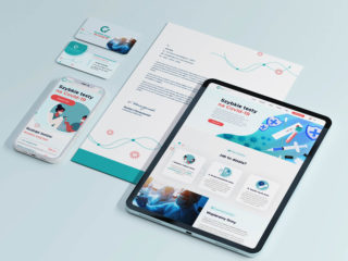
I created for them stylish and minimalistic online store using wireframing tools like Figma and developing a design using WordPress and WooCommerce. I managed to connect their ordering system with the website and set up an online payment gateway. Thanks to that they are able to manage their business exclusively online.

Research and goal
A field research combined with creating a user persona provided me with essential information to build a customer story and experience map, from which I identified a few problem areas. These also gave me some opportunities to deliver a better experience through the website design and features of the whole buying process.
Overall, I wanted to design a website with atmosphere and style to reflect the world of alcohol. I wanted to optimize the navigation, categories and product search so that users are exposed to different discovery paths to find new products. When buying drinks, you can’t taste test them, so it’s important to elevate the other senses when trying to sell the product.


Wireframing
If you want to see your business grow, creating a strong brand is a must.
After describing all features and prioritizing solutions I found during research, I started wireframing my ideas and the site began to take form. That stage is really helpful to see how our ideas would look on a final page, and whether we were adding too much or too little.
I chose red wine colour as the primary colour as it is joyful, warming and product-related and dark grey as the secondary for its calmness and serenity. Simple icons and fonts choice highlight minimalistic approach.


Result
Navigation: The previous navigation was unbalanced with overloaded options and categories. I pared it down based on popularity and also provided some alternative product discovery paths. Importantly, for users they can easily filter down by price or categories.
Search: A rich search result has a huge impact. From providing inspiration and discovery pathways to exact product thumbnails, there’s plenty of information displayed to help customers and lead them to their desired purchase.
Product features: A market research showed that for many people buying alcohol can seem complicated and they don’t know how to choose. My goal was to change so that I decided to give all product a clear feature like: its taste, an alcohol volume, acidity or region of production.


Conclusions
I wanted to design specifically for those user groups are important for my client, because all these solutions indirectly support business objectives like in cart value and customer loyalty. These are not only for individual but also B2B solutions.
By helping them learn more and explore alcohol, they can come to trust this brand as a place to go for knowledge and helpful purchasing advice.