Brief
I was asked to help a personal trainer with his new online business. He needed a fresh website and a whole new brand identity with marketing strategy to launch on social media.
Bartek is a very talented person with many passions and huge knowledge about training and nutrition. Being very successful himself in that field, he decided he wants to share his knowledge and help people to achieve their goals.
The idea was to run his business online especially regarding the circumstances of 2020 whereas online personal training and diet services are growing with popularity. Therefore I designed a website that offers all functionalities to chose and order a proper training or diet plan and do it yourself at home.
Website
Since website is the face of every business, especially for online business it became crucial that website was aesthetic, user-friendly, effective, and engaging.
Bartek approached me in spring 2020 to help him with his website launching and building a consistent branding.
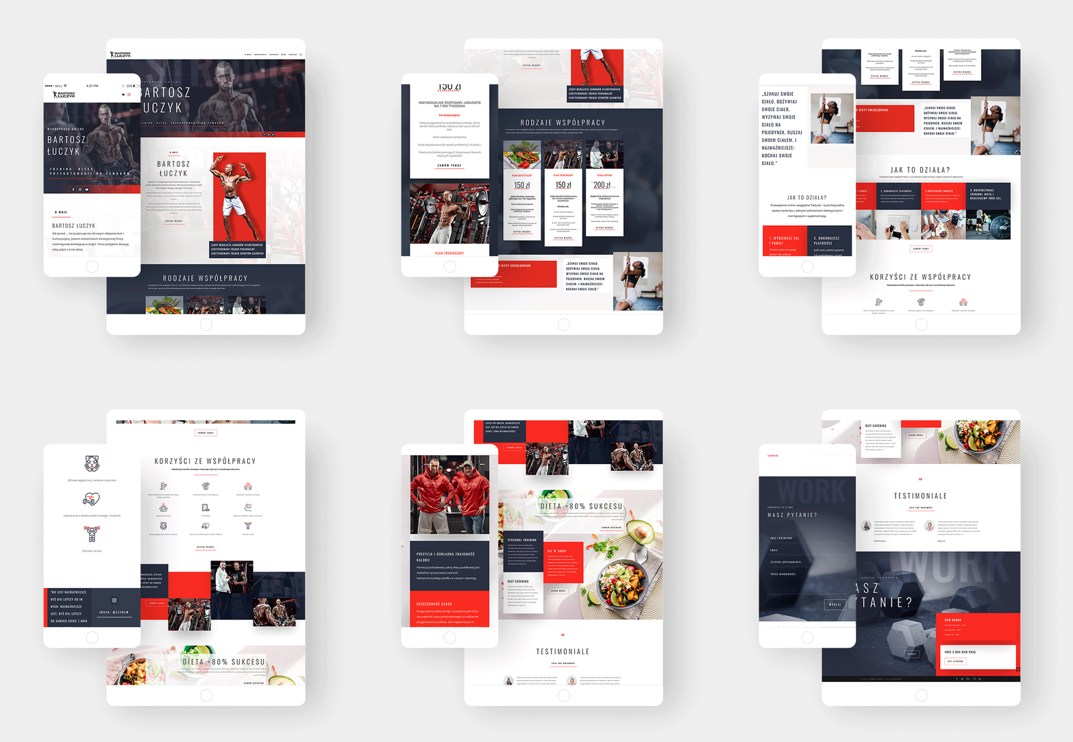
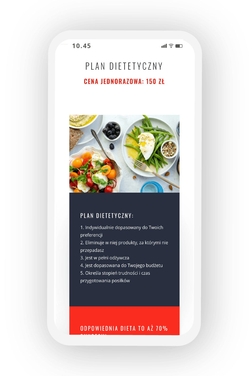
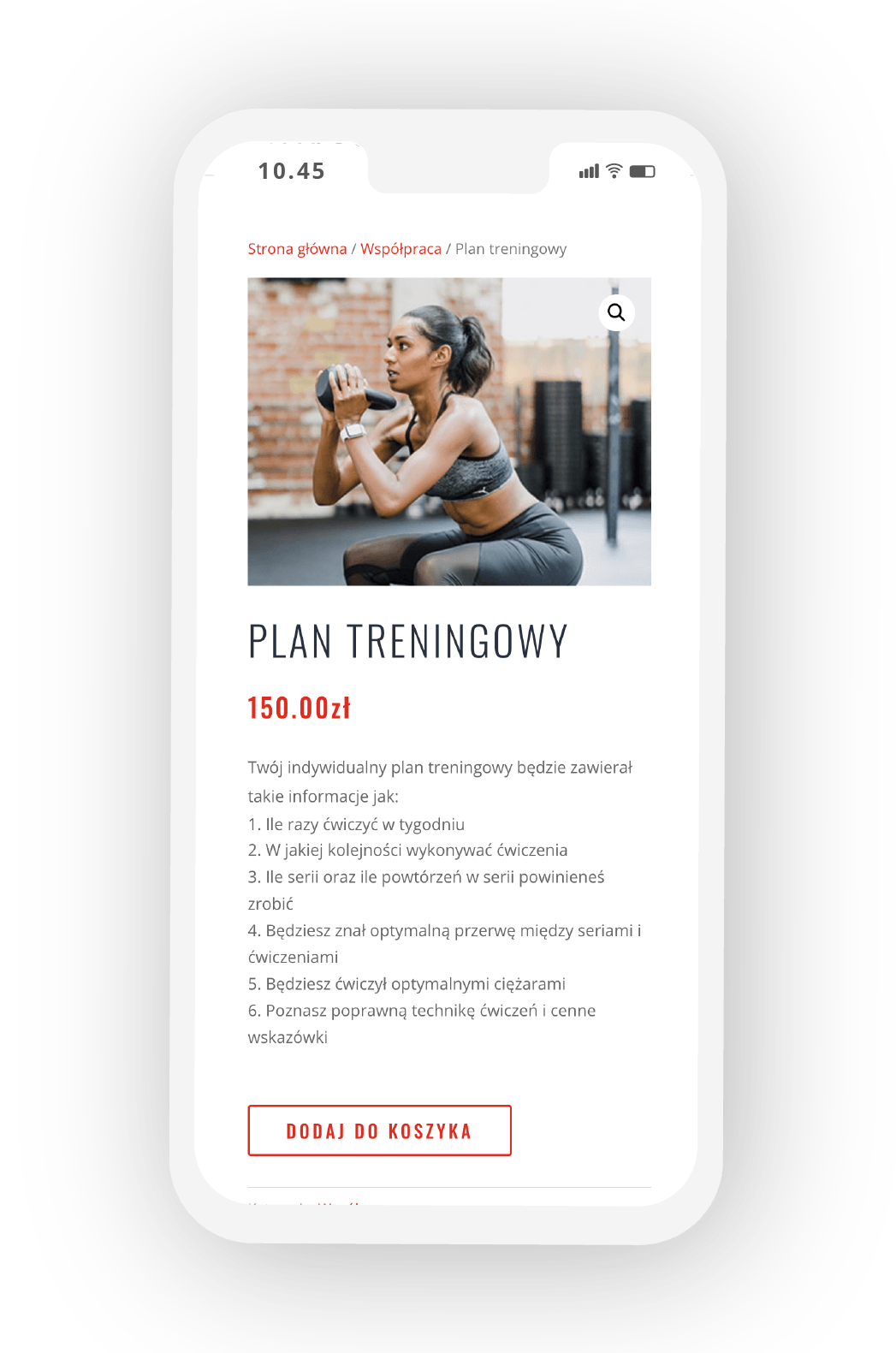
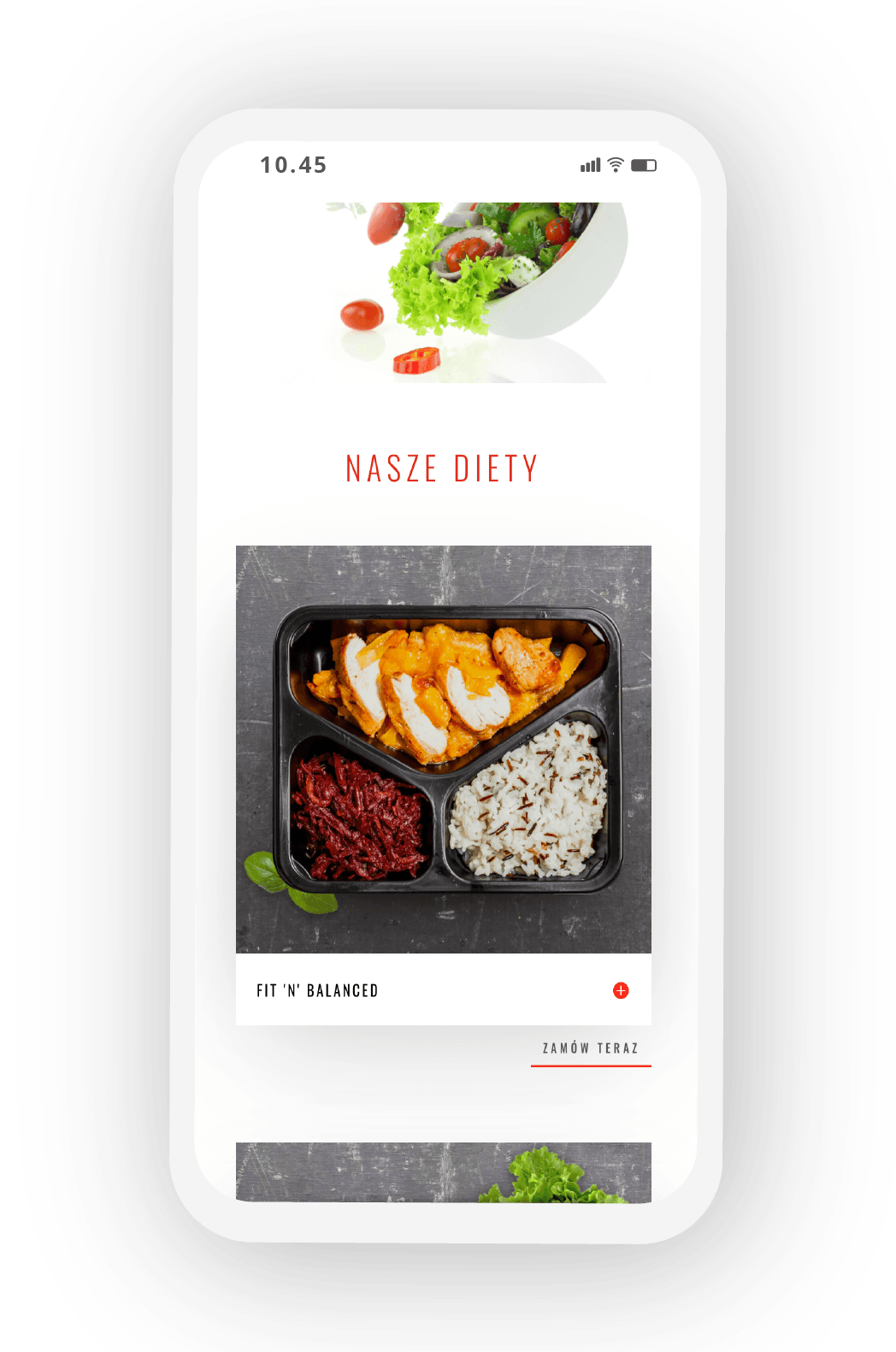
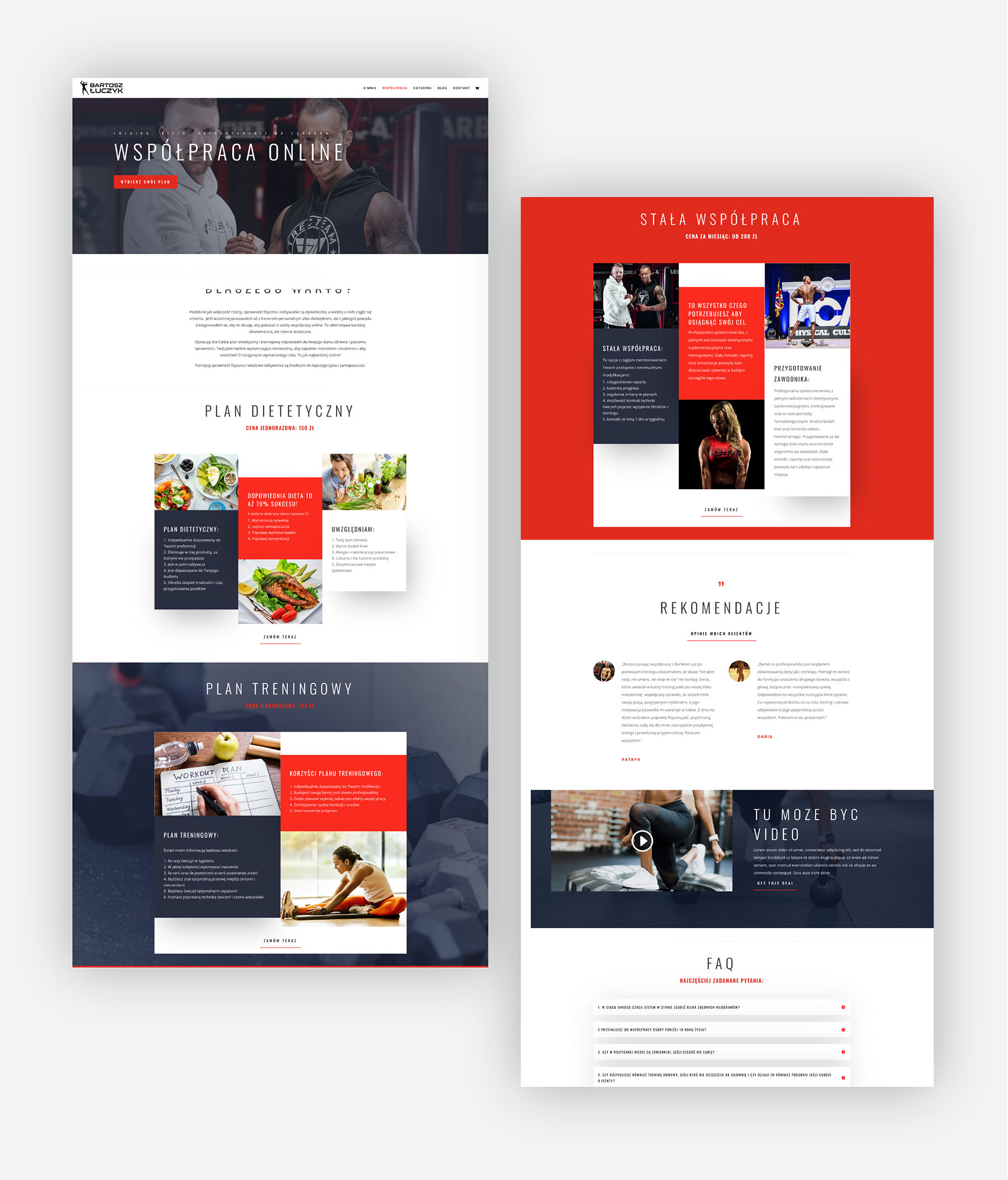
Main objective was to encourage users to purchase one of three main products: online diet plan, training plan or long-term collaboration. Clear and easy to navigate offer presentation was what I was aiming for.
I divided a grid into 3 columns to show three tiers of collaboration that is easy to read and understand. Underneath I presented a booking process in 4 visual steps. Thanks to the use of infographics I could visually present the benefits of the service.
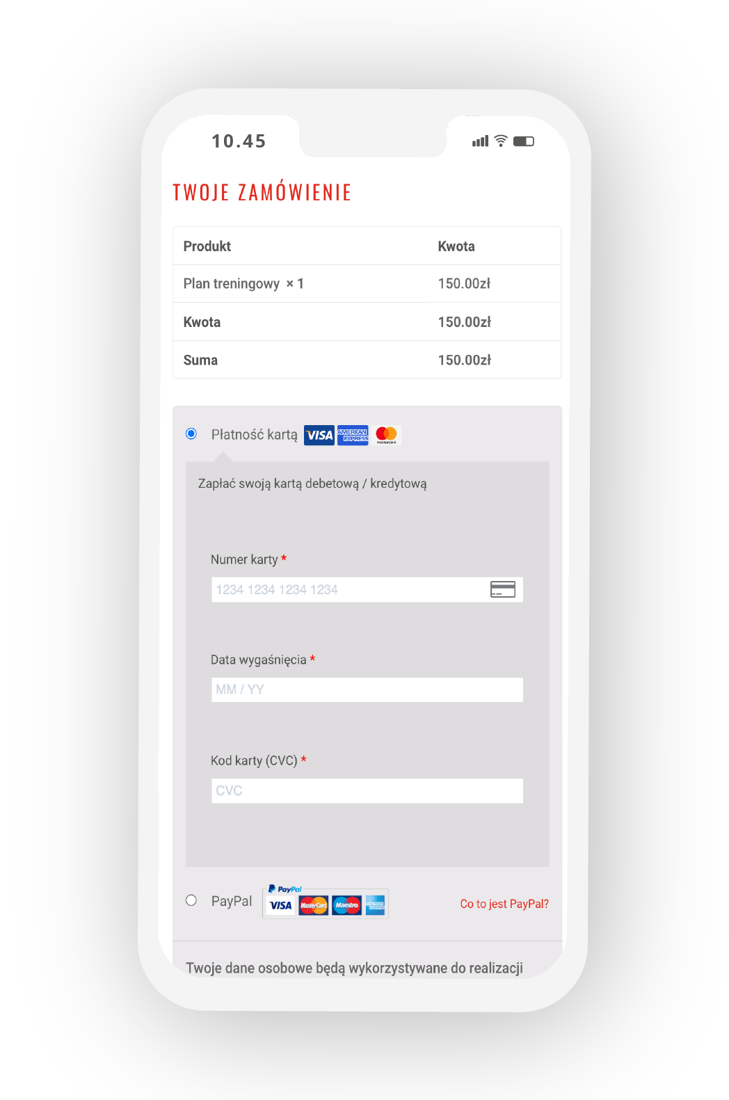
I decided to follow “3 step rule” – which means that from the information about the product till the order page and final click has to be maximum 3 steps. That rule makes the user experience much smoother and easier.
Design
Core part of designing process was choosing a strong colour palette and representative imagery.
I decide to enhance users’ experience by selecting a complementary color palette to give a balanced-look to a website design. I used 2 strong colours in my colour palette – red and dark blue – which are visually appealing and commonly related with gyms, fitness, personal training.
Obviously the use of right images was super important as well. Imagery had to form an impression of professionalism and credibility in the visitors mind. Images must have been expressive and capture the essence – showing off Bartek own achievements and impressive physics.
Consistency
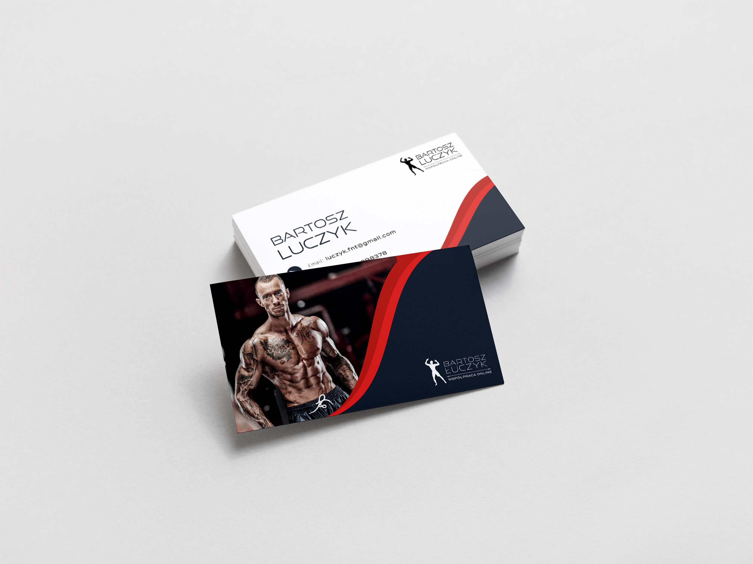
No business can’t exist without a logo and a coherent branding approach. Designing a logo always should come first and so I did in this case. Bartek wanted something simple and straightforward, so I decided to draw his silhouette in a bodybuilder pose and chose some punchy fonts.
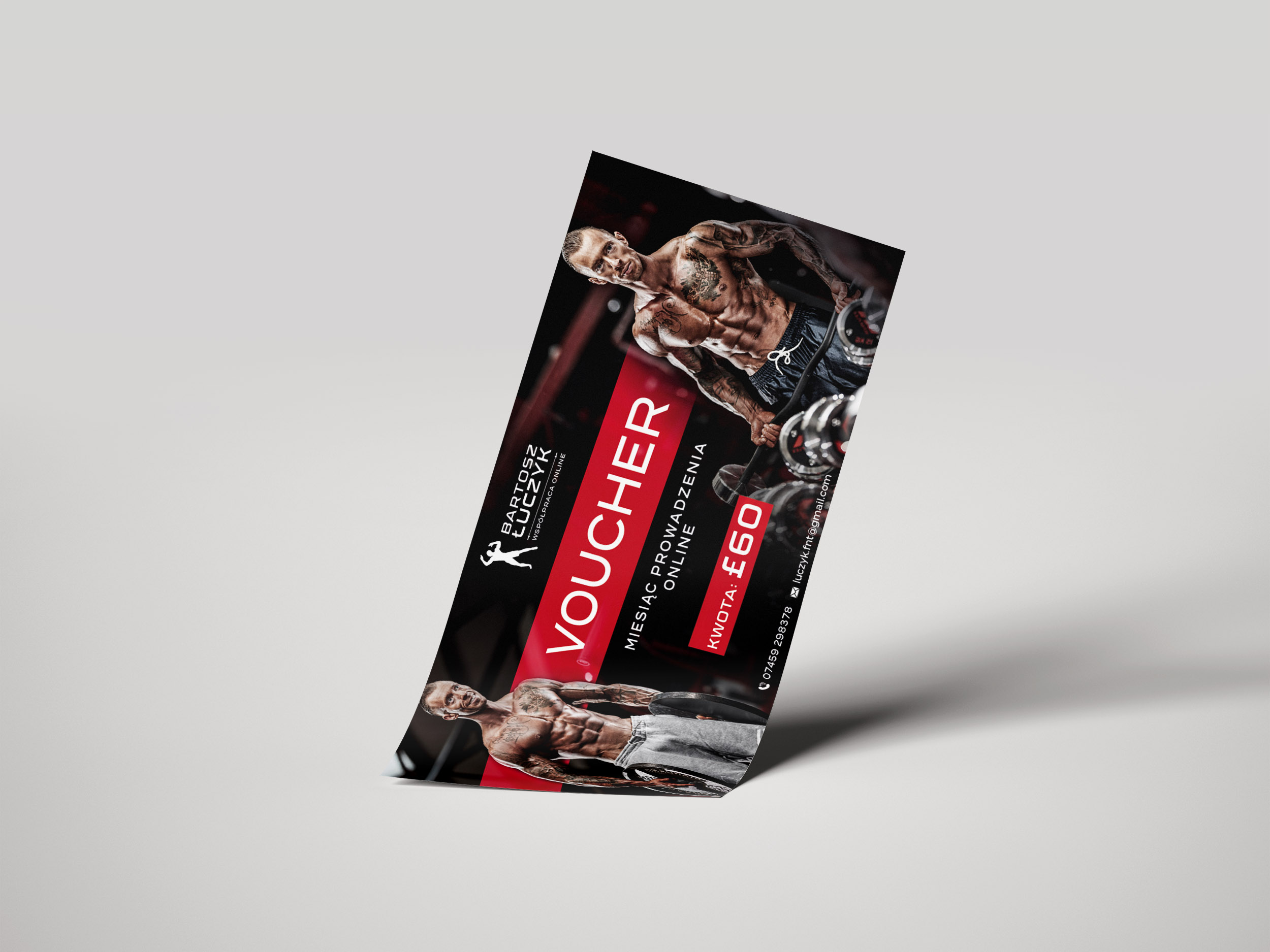
Designing business cards and collateral marketing material followed launching the website. I tried to keep consistency between all elements of branding.
