Brief
Orange Fab is a global program for the Orange’s start-up accelerator, to select promising start-ups and offer their business grow globally.
Website is meant to be a platform connecting startups to corporations for strategic investment and partnership opportunities. Furthermore it allows candidates to apply for the program through the application form.
This project was a teamwork and a big challenge as my client is one of the largest operators of mobile and internet services in Europe.
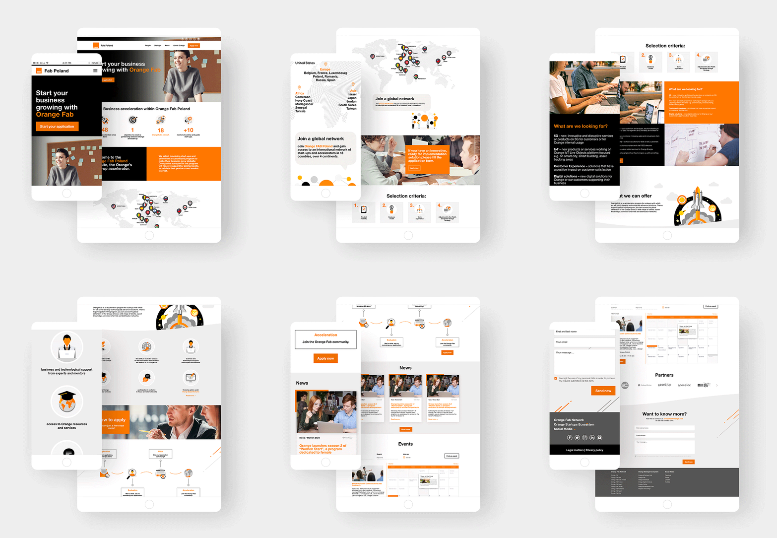
Homepage
Working for Orange meant a great challenge to me and I love hard tasks! I had to stick strictly to the brand guidelines, cooperate with many team members all around the world to make the design coherent with sister-sites from the other countries.
The homepage was meant to contain the most important information about the program. I tried to present all that dense content in a more visual way. Therefore I used infographics, visual map, speech bubbles, sliders. To present events I designed mobile friendly events calendar.
I divided a grid into 3 or 4 columns to keep increased legibility and visually pleasant layout. Sections and pages are well-organised with a top-down design so visitors can easily browse through the different areas of the site. Wise use of CTA to send user to application form was crucial.
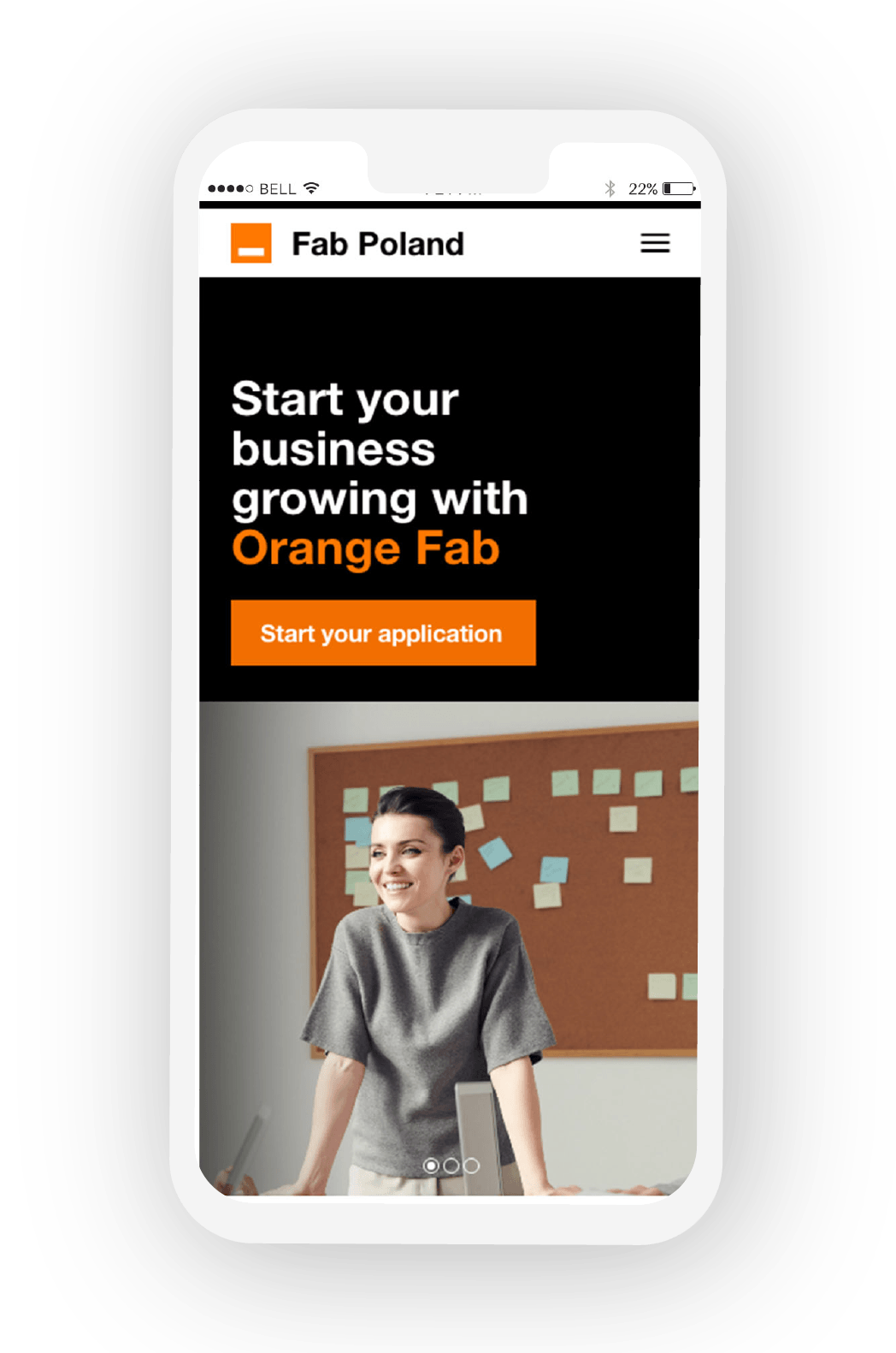
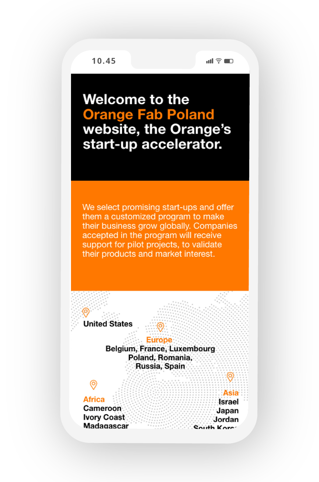
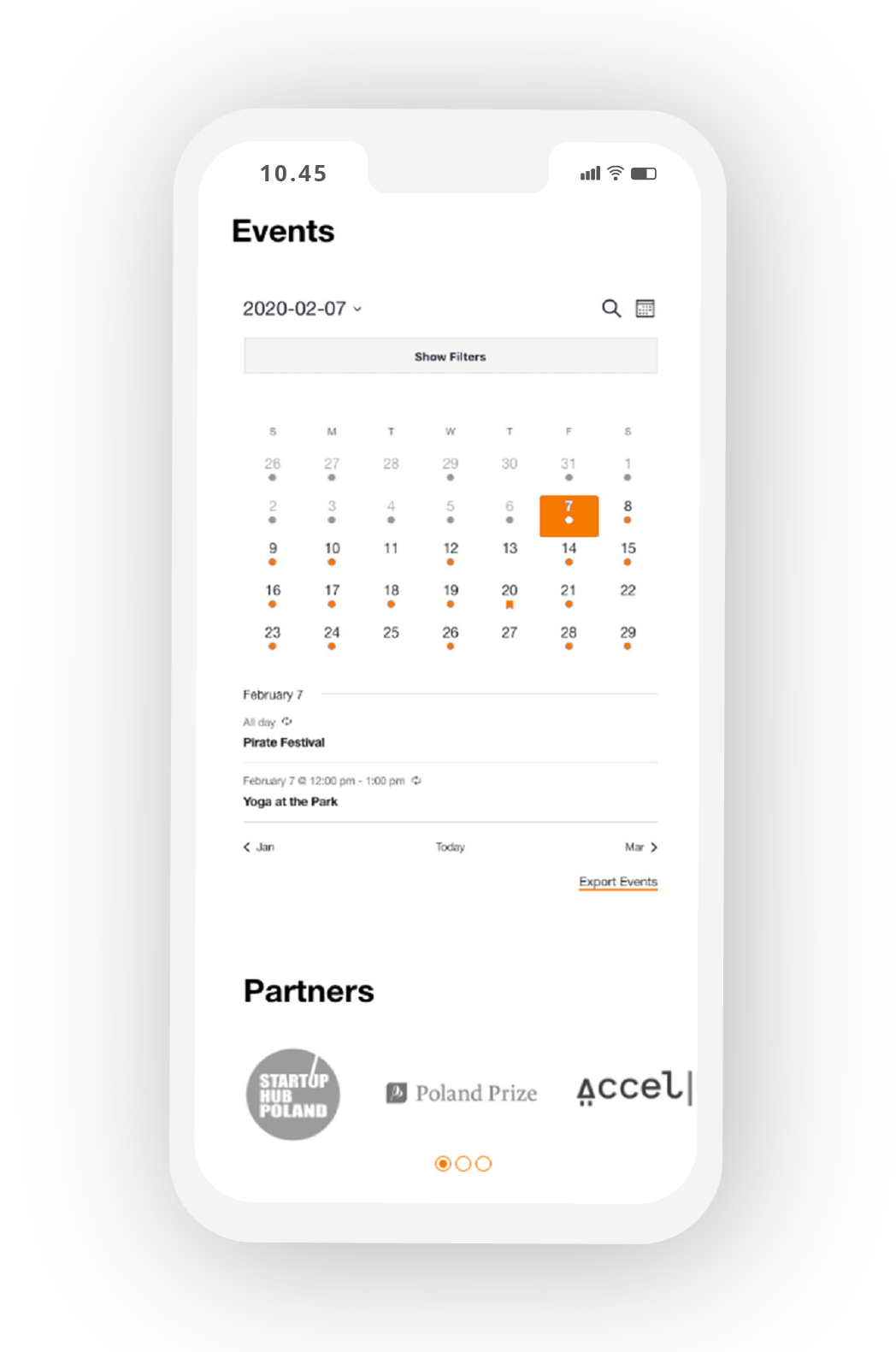
Pages
After designing a homepage, a core part was creating a user friendly application form and other pages.
I had to also keep consistency while designing the rest of the pages. ‘About us’ page obviously aimed to tell more about a company and its values. I presented company in numbers as per visual infographics and brand colours – orange and black.
‘News’ page shows tiled-shaped grid with images and brief intros of latest news meanwhile ‘Events’ shows a calendar with upcoming corporate events with the possibility to book a spot online.
Application form
The core part tho was to design a UX and UI friendly application form that allows participation in the program. In the past they used to have very long and complicated form and therefore a high bouncing rate on this page.
I decided to simplify the form by dividing it into 4 steps with different screens for each one both on desktop and mobile. User can see which sections he/she is currently viewing and also see the progress of the application process.


