Brief
Orange is one of the largest operators of mobile and internet services in Europe. As a global brand it cooperates widely with business and seek for investors.
Polish division of Orange responsible for investor relations approached my team in order to redesign their website. The brief was to adjust the appearance of the website and its functionality to the main Orange website and the brand manual.
Their existing website was old-fashioned and its navigation was way too complicated, consisting with very extensive menu and submenu, so to find any kind of information was basically impossible.
My first suggestion was to design a new website from scratch, proposing a more user-friendly information architecture – based on one-pager structure and simplified menu.

Designing process
The challenge I faced was to work with a big amount of text, tables ad basically a boring content. How to put all that content and avoid the user to get fed up with an eternal scrolling?
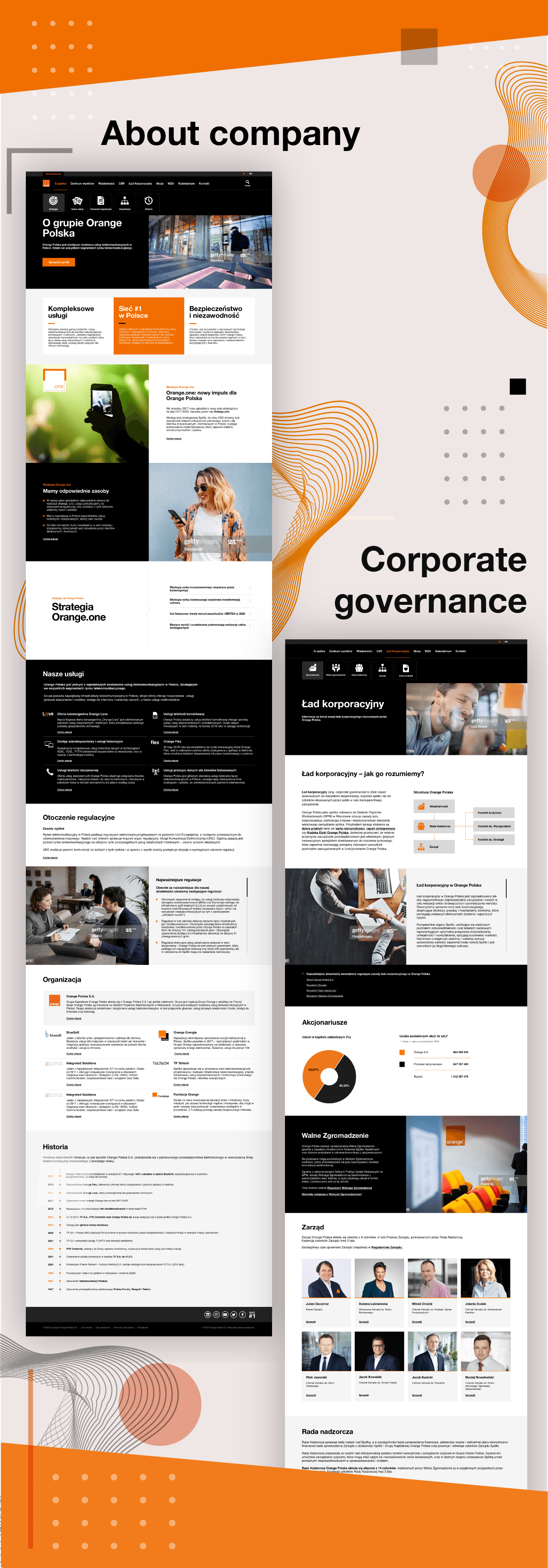
The new redesigned website consisted of homepage and other pages: ‘About company’, ‘Result center & news’, ‘Corporate governance’, ‘Shares’, ‘Calendar’ and ‘Contact’. Menu was grouped in 3 sections to avoid extensive menu bar and simplify navigation.
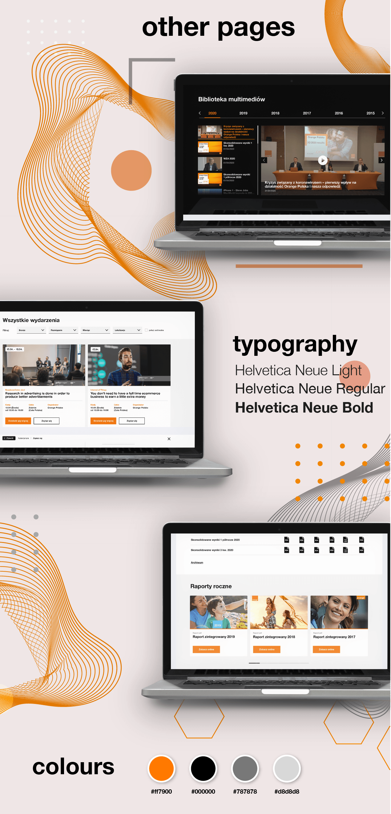
Having in mind Orange’s strict brand guidelines and a need to work with a manual, I had to find a compromise between designer’s passion for creativity and consistency with existing material, colour palette and typography.
The challenge I faced was to work with a big amount of text, tables ad basically a boring content. How to put all that content and avoid the user to get fed up with an eternal scrolling?
I developed some smart solutions that helped me “hide” some big chunks of text like inner scrollers, “drawers”, drop-down sections.
I also tried to divide the page into clearly defined sections in order to make it easier to scan and focus. I tried to use different background colours of each sections, use distinguished images or other design elements to define different sections.

User experience
Thanks to the above approach I managed to improve the users experience by allowing navigation of the website with more natural flow. The key point is to find a balance between most important information and the white space around.
Each section of the website also provides one clear header, subheader and a few supporting points, making it easier to digest information. The wise use of lifestyle imagery also helps to arouse appropriate emotions about the company as a humane and friendly.
In order to provide the user with a beautiful experience as they navigate through the site, it is important that they know they are still in the same place. While designing the other pages I had this in mind and tried to make all the graphical elements consistent so that everything is themed to make a design coherent between pages and on the same page.


