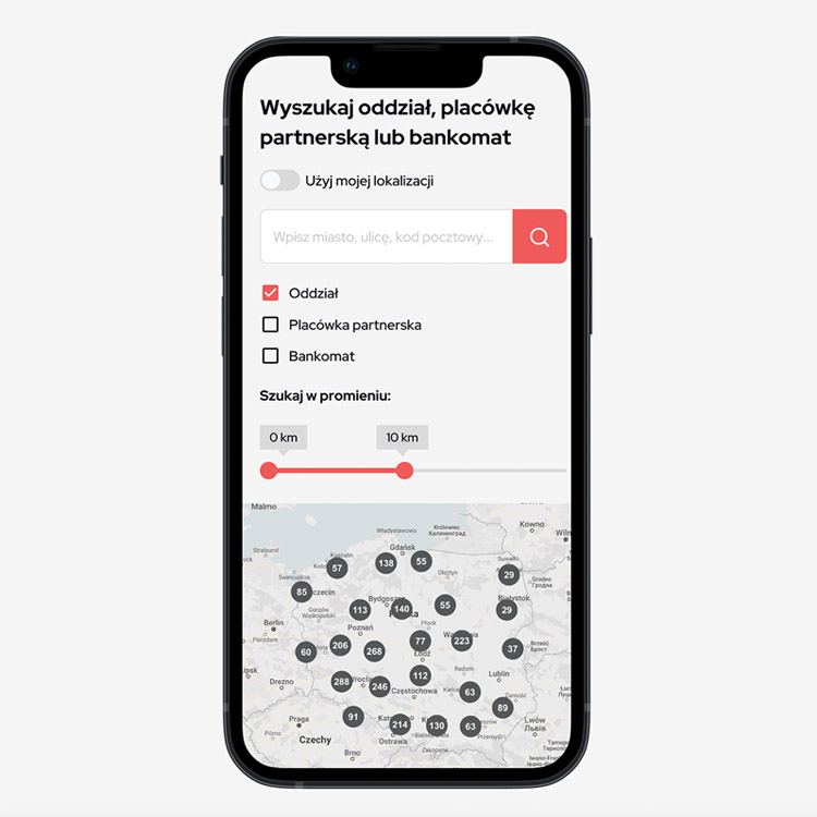
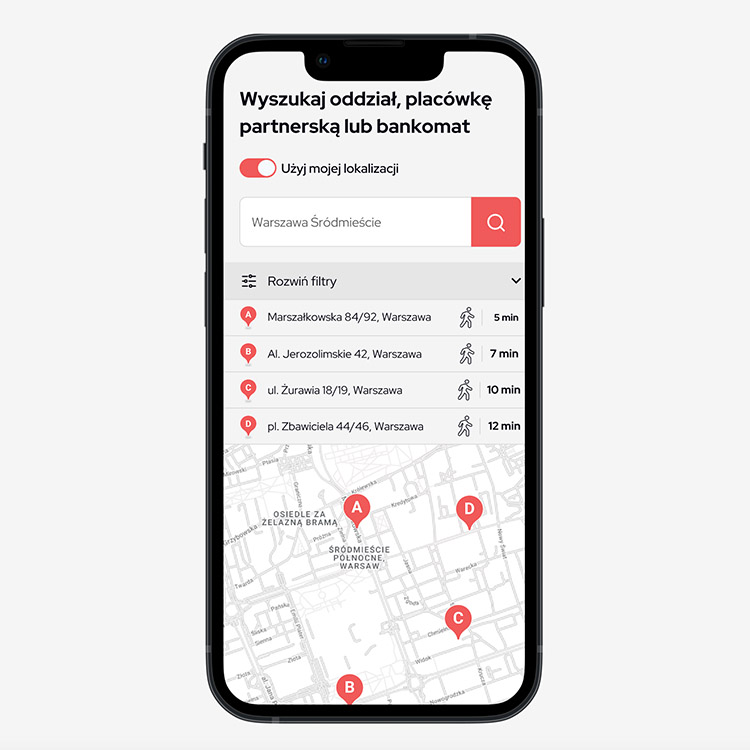
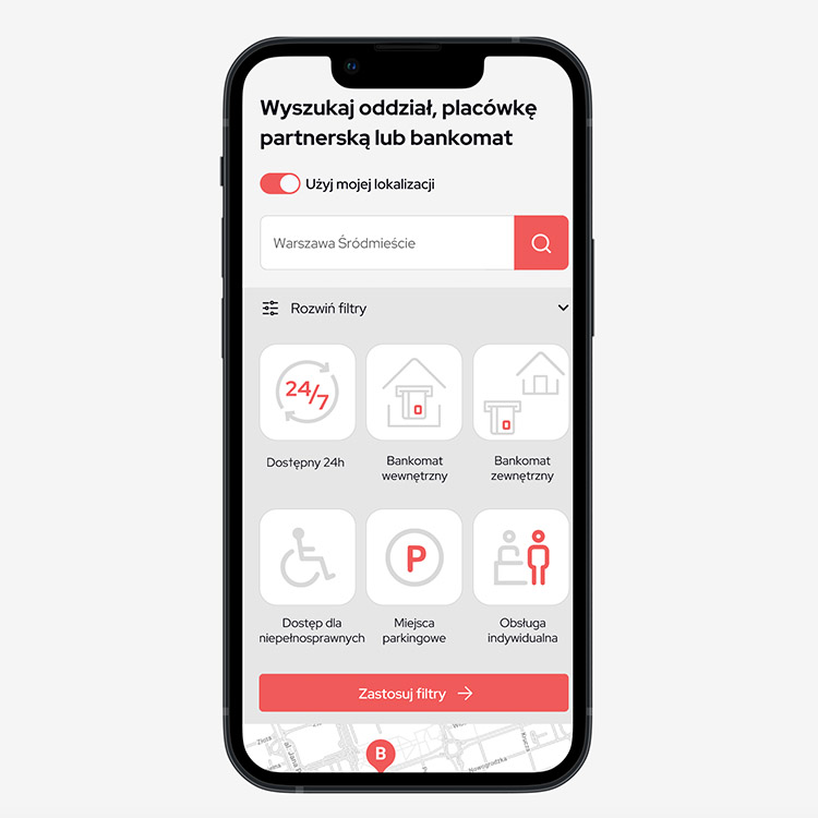
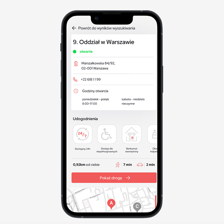
MVP
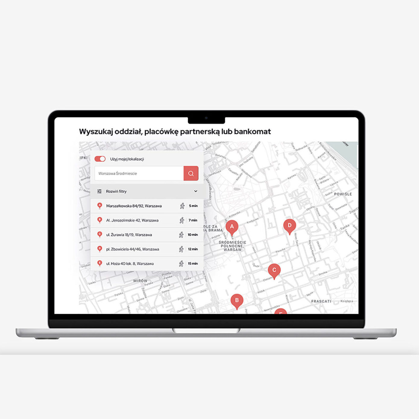
The goal of this project was to design a user-friendly tool for searching bank branches, offices, and ATMs for a specific bank.
Brief:
The tool should be accessible on desktop and mobile devices, providing users with a seamless and efficient way to find relevant locations. The key focus is on improving the user experience by minimizing the steps and interactions required to complete a search.
A very important element will be to create a layout with the smallest effective focus area. This will drastically affect the high usability of the solution.
Benchmarking
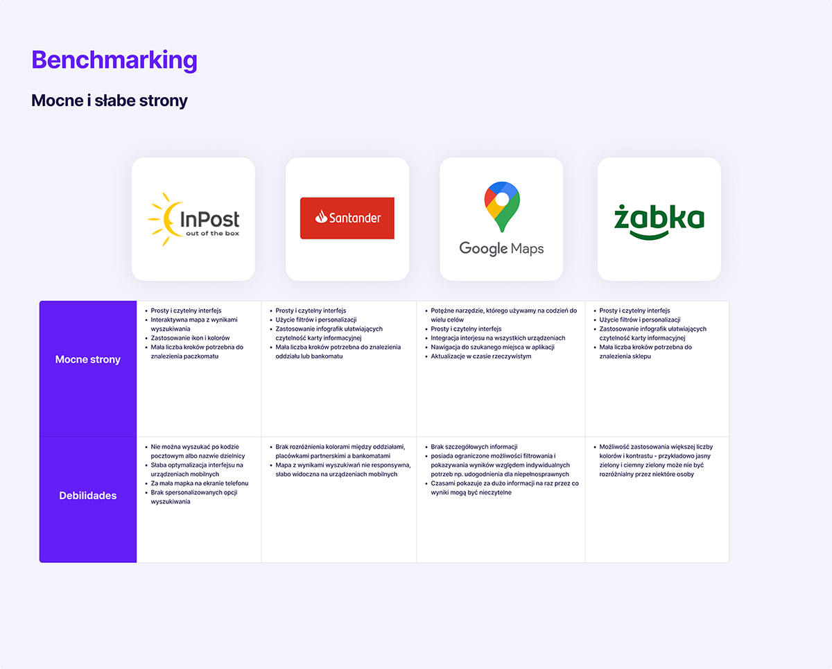
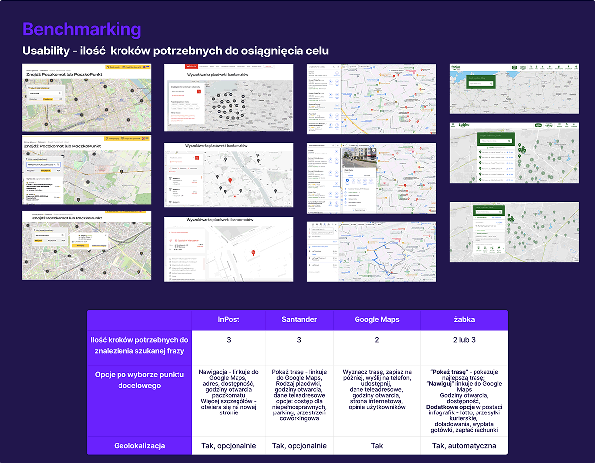
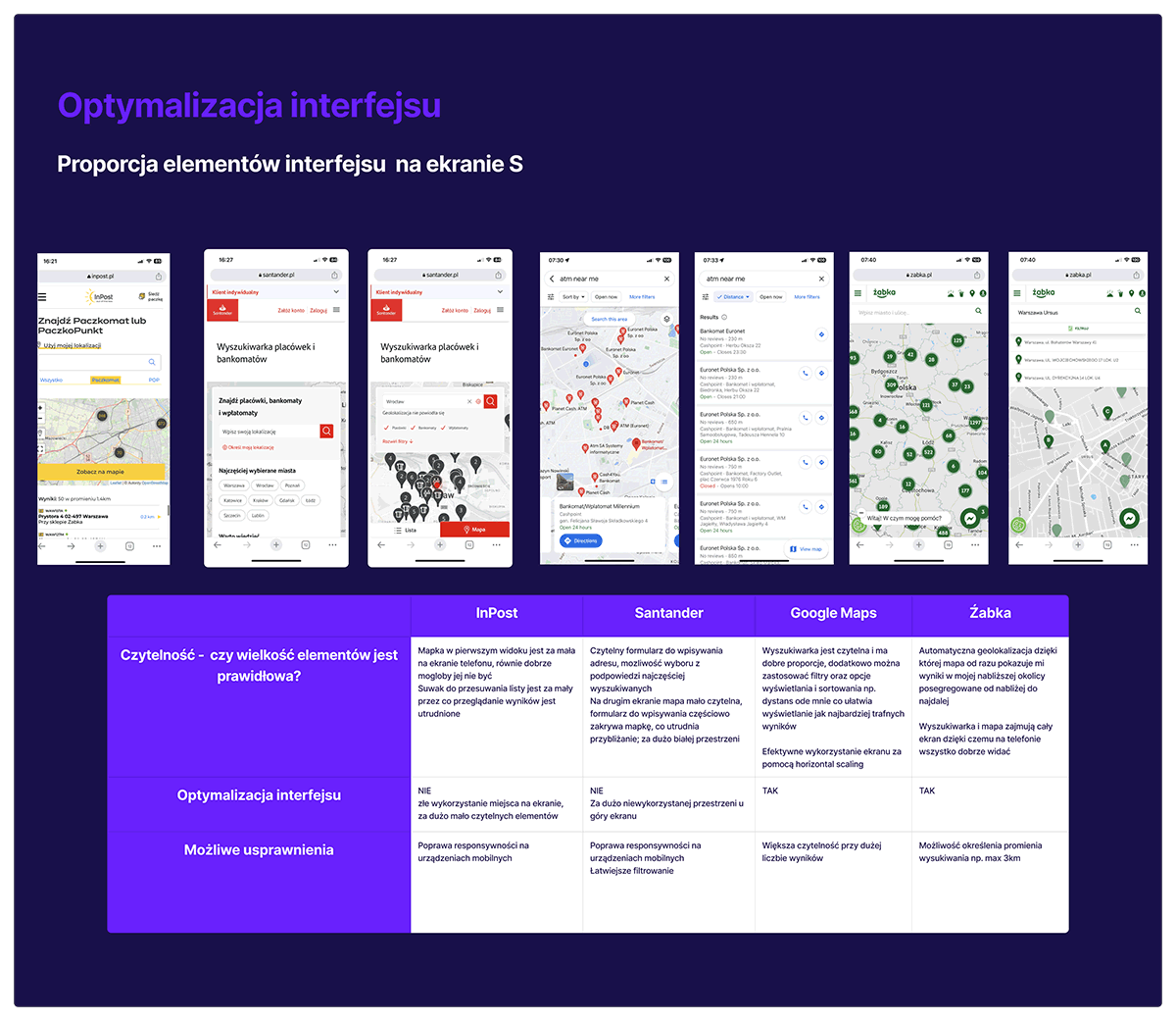
During the desk research and competitor analysis phase, I compared various platforms that use searching tools including InPost, Santander Bank, Google Maps, and Żabka. Through this analysis, I gained insights into the features, user interface, and user experience of these platforms. I identified the strengths and weaknesses of each competitor, highlighting the opportunities for improvement and differentiation in my own tool.
- Google Maps’ Map Interface: Google Maps provides a well-known and intuitive map interface. I decided I could adapt a similar interactive map into my design, allowing users to visually explore the locations of bank branches, offices, and ATMs.
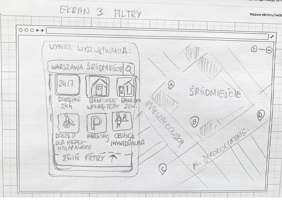
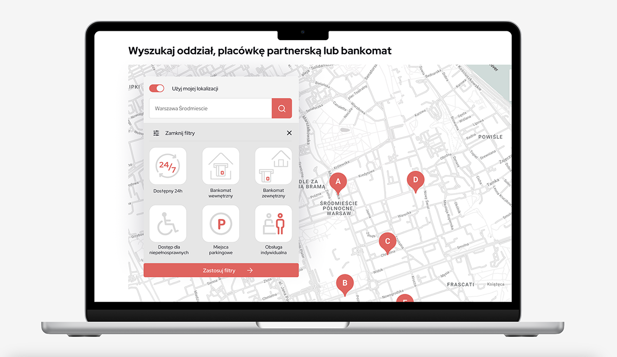
- Santander Bank’s Filtering Options: Santander Bank offers robust filtering options in their search functionality, so I consider implementing similar filters in m y tool. This could include options such as availability of 24-hour ATMs, accessibility features, or personalized services.
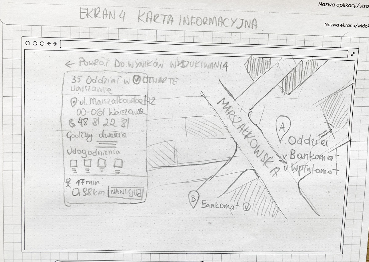
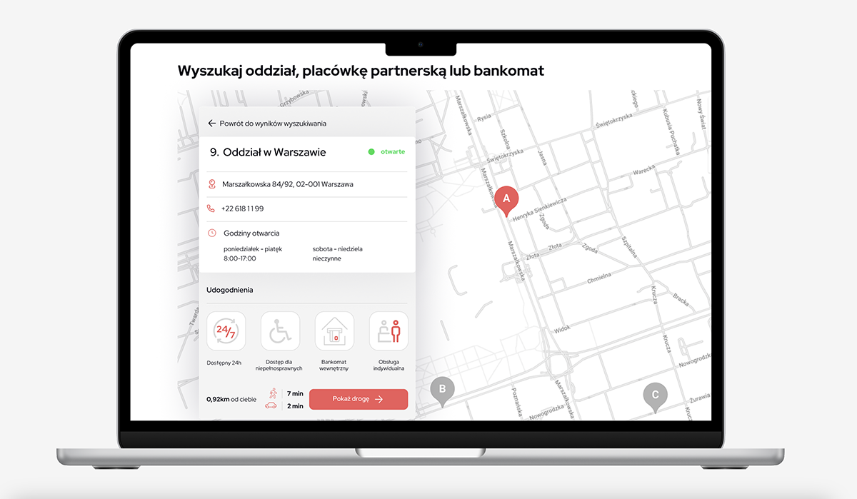
- InPost’s Location Details: InPost has a very simple and intuitive tool to presents detailed information about each location, including images, ratings, and additional services. I think it would be great to provide bank’s users with comprehensive information about bank branches, offices, and ATMs, allowing them to make informed decisions.
- Żabka’s Ease of Use: Żabka is known for its convenient and user-friendly experience and visually appealing app. I looked for elements in their design that contribute into mine like use of nice icons and infographics, clear navigation, prominent search functionalities, and intuitive layouts.
Paper Prototyping
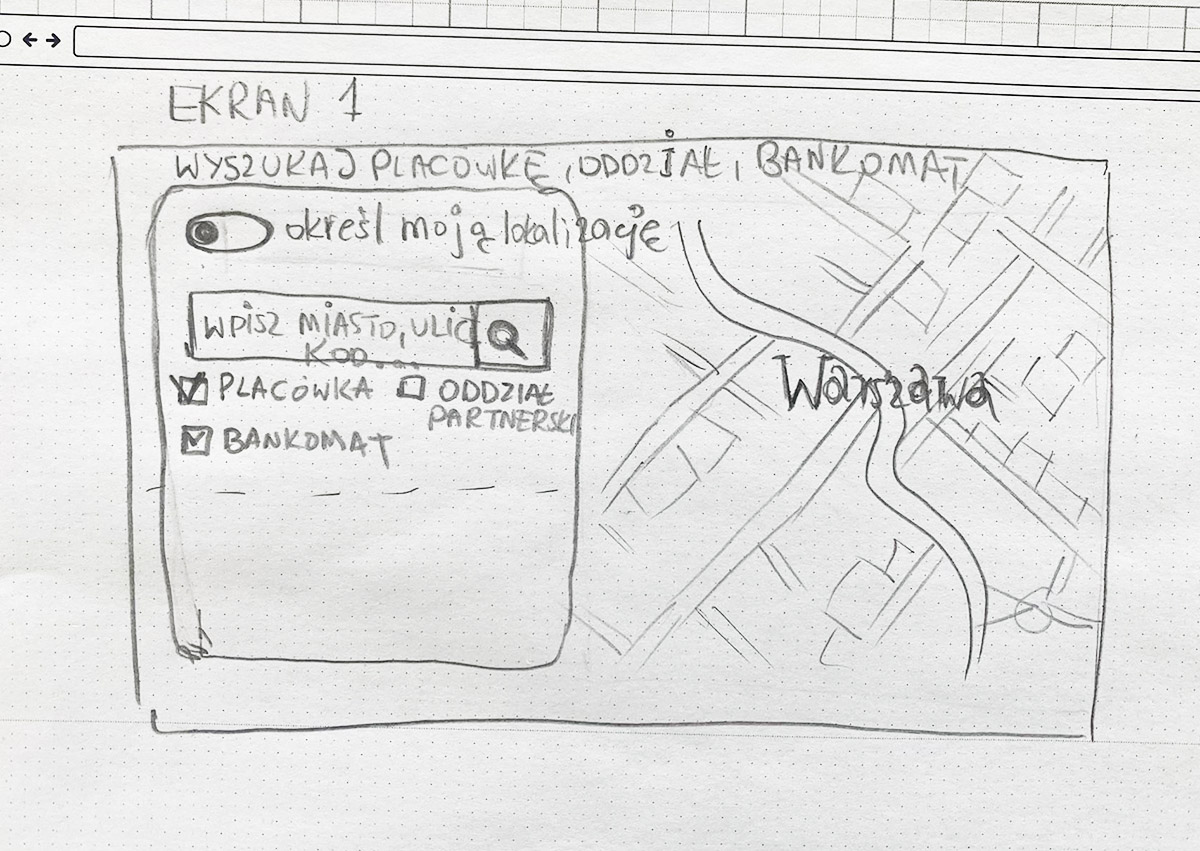
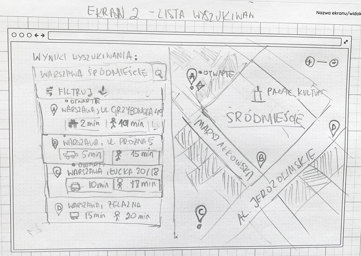
Based on the research findings, I created paper prototypes to explore different design ideas and layouts for the tool. These prototypes allowed me to visualise the main screens, such as the homepage, search results, filters and location details. Through multiple iterations, I refined the prototypes to optimize information architecture, ease of use, and visual hierarchy.
User Testing
Instead of recruiting a specific target group, I conducted guerilla testing. This approach involves testing the paper prototypes with individuals who match the general profile of the bank’s customer base. During the user testing sessions, I observed participants as they interacted with the prototypes and completed specific tasks. Through this process, I identified usability issues, and discovered areas for improvement.
High-Fidelity Wireframes:
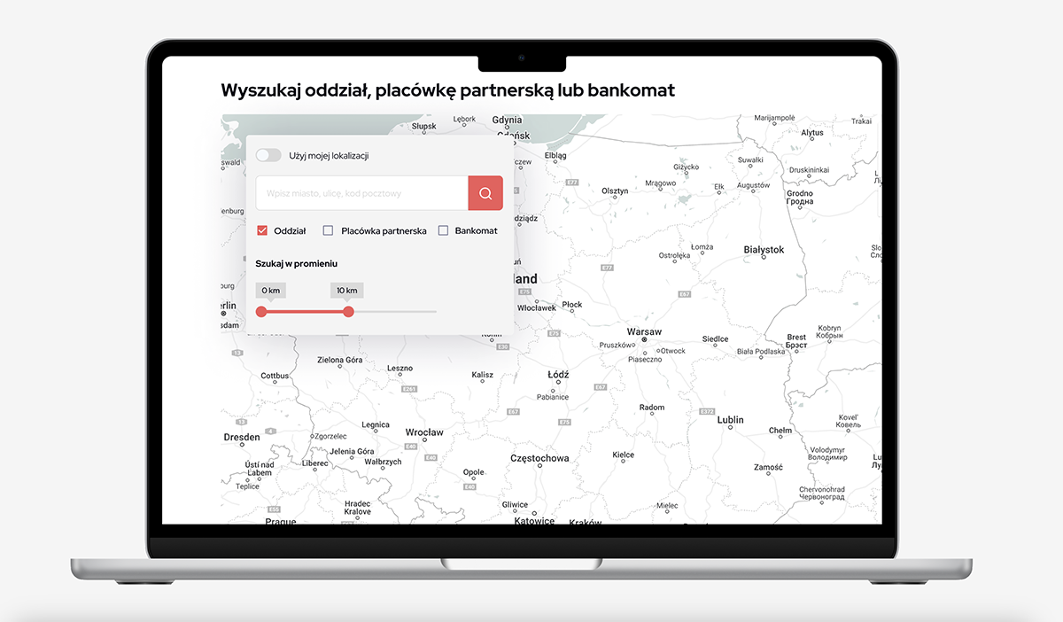
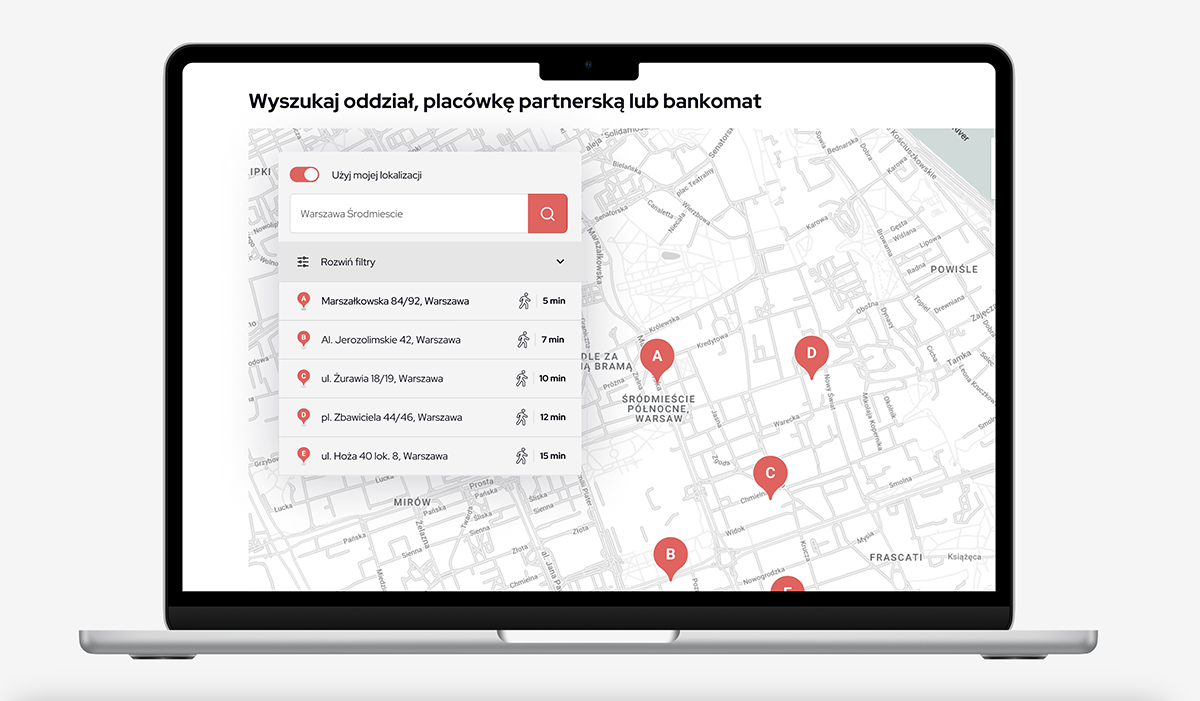
Based on the refined paper prototypes and insights from user testing, I created high-fidelity wireframes for both the desktop and mobile versions of the tool. These wireframes captured the visual design, usability, and responsive layout of the interface. Key features such as search functionality, filters, location details, and maps were incorporated into the wireframes. Careful attention was given to the placement of elements, color scheme, typography, and overall aesthetics to create a cohesive and visually appealing user interface.
Iterative Refinement:
Based on the feedback received during second user testing of the high-fidelity wireframes, I iteratively refined the design. This involved addressing any identified usability issues, optimizing the user flow, and making necessary adjustments to enhance the overall user experience. The final design aimed to align with the objectives of the bank and provide a seamless and efficient search experience for users.


